adding drop letter with css
2020-06-18
|~4 min read
|704 words
I recently added a drop letter to my blog. I’ve always liked them in magazines and have seen them well used on the web.
As with many things on the web - there are a number of ways to achieve the goal. In researching how to do this, I found three general approaches:
- Modify the mark-up and use a class / id to target the character.
- A traditional CSS approach using the
:first-letterselector - A modern CSS approach using the
:initial-letterselector
All three work - though, I ended up going with the second due to poor adoption on the third. Maybe one day I’ll revisit since the API is certainly simpler!
Let’s look at them in turn:
Modifying The Mark-Up
The first option is well suited for non-programmatic approaches. It’s also quite simple due to the specificity afforded by using a class.
Here’s a small Codepen to see what I mean:
By modifying the HTML to wrap the first letter with a span, we can modify just that letter.
The CSS of course can be tweaked - though here is a balance that I ended up liking:
.first-letter {
  color: rgb(70, 70, 70);
  float: left;
  font-family: Georgia, serif;
  font-size: 3.5em;
  font-weight: bold;
  margin: 0 0.2em 0 0;
  line-height: 0.75;
  text-transform: lowercase;
}
If that’s not an option, or you’re faced with adding a drop-cap on hundreds of pages, like I was, this doesn’t feel like the best option. For those, we should look at pure-css approaches.
Let’s look at those now.
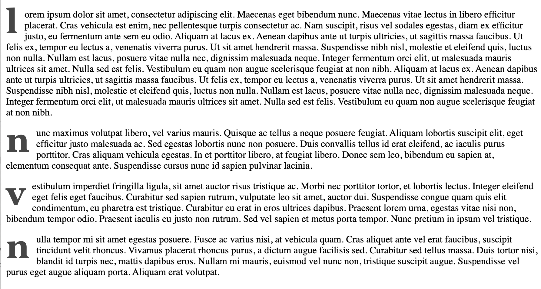
CSS With The :first-letter Selector
At first blush, it appears that we can just replace the class span with the CSS from the first-letter class and apply it to the :first-letter selector, however, if we try this we’ll quickly realize the issue with this approach. It makes the first letter of every paragraph a drop letter!

If you want to see this more closely, here’s the Codepen. I’m more interested in fixing it, however, so let’s do that now.
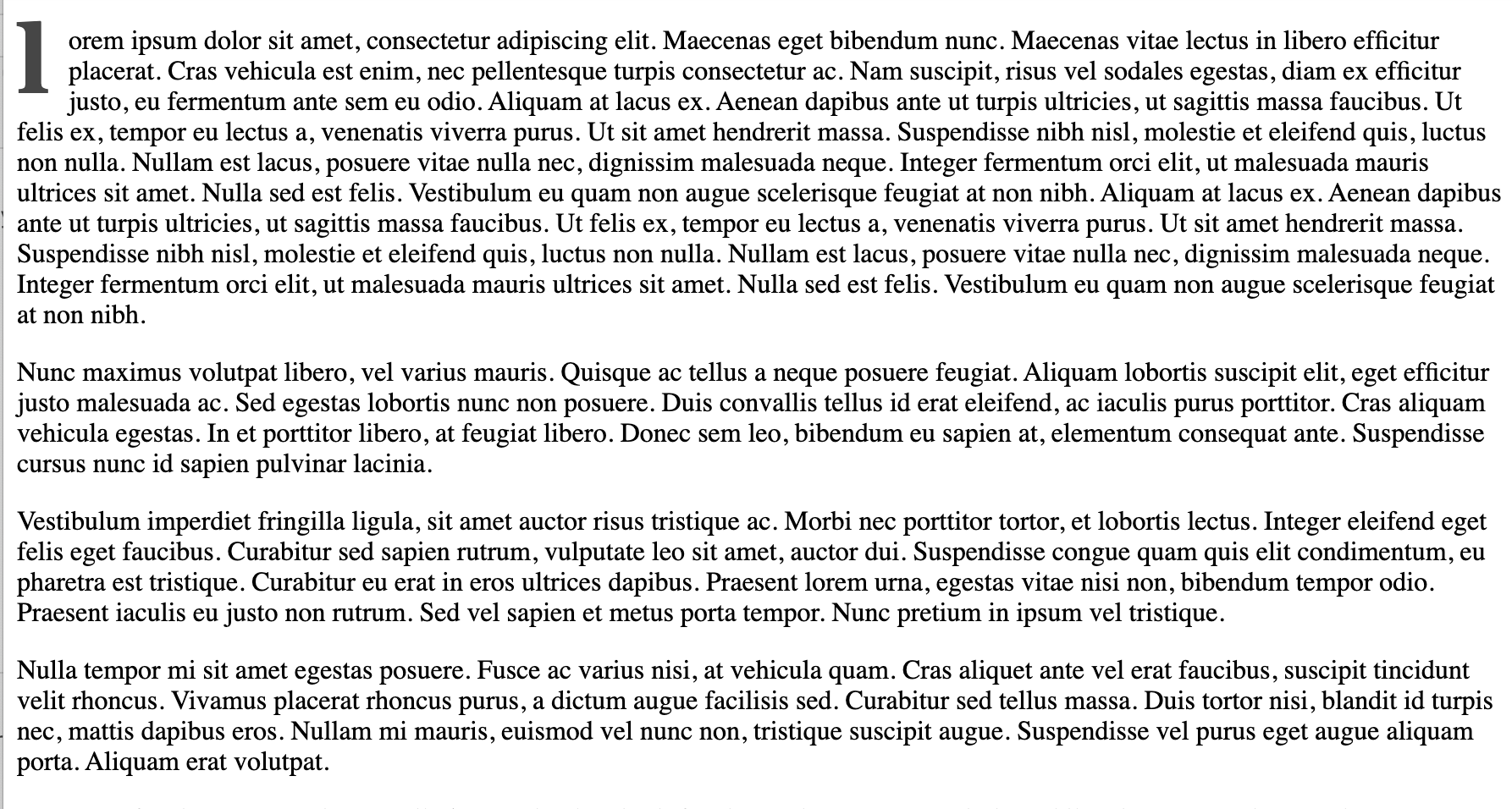
The first-letter worked. It just worked too well. We’ll need to be a bit more strategic in how it’s applied! This is accomplished with the help of the :first-of-type selector. To see how, let’s assume that all of the content of an article is wrapped in a div. For clarity, I’ll apply a class to that div of article-content:
.article-content > p:first-of-type:first-letter {
  color: rgb(70, 70, 70);
  float: left;
  font-family: Georgia, serif;
  font-size: 3.5em;
  font-weight: bold;
  margin: 0 0.2em 0 0;
  line-height: 0.75;
  text-transform: lowercase;
}
And just like that, only the first letter in the article has a drop letter!

CSS With The :initial-letter Selector
The initial-letter is designed to give precise typographic control over a single letter — aka exactly what we achieved above, but with a much simpler API.
I highly recommend checking out some of the examples in the draft proposal. They’re quite nice and elegant!
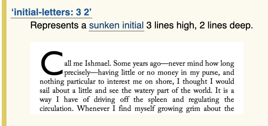
For example, if we didn’t want a “drop”, but a “sunken” first letter (i.e. one that sinks, but not all the way, we could do:
.article-content > p::first-letter {
  initial-letter: 3 2;
}
This translates to a first letter that is “3 lines high, 2 lines deep”:

Unfortunately, the CanIUse story is just not where it needs to be for use in a website, that said, you can use a media-query to progressively enhance the experience for those who might be able to benefit from it, for example:
@supports (initial-letter: 1) or (-webkit-initial-letter: 1) {
  .article-content > p::first-letter {
    initial-letter: 3 2;
  }
}
Wrapping Up
I’ve always admired the printed page and I want my site to feel like the best parts of reading on paper — though from time to time more interactive.
With that in mind, the new addition of a drop cap is part of that trend and I hope you learned a little along the way!
Additional Reading
In writing this post, I leaned on two blog posts in particular to help me understand drop caps:
Related Posts
Hi there and thanks for reading! My name's Stephen. I live in Chicago with my wife, Kate, and dog, Finn. Want more? See about and get in touch!